Moozey
Overview
Moozey is a visitor analytics platform designed for museums. It helps museum teams understand who visits, how people move through their spaces, and what they think about their experience. By turning complex data and large volumes of visitor feedback into clear, actionable insights, Moozey makes data-driven decisions more accessible to people without a technical background.
The result
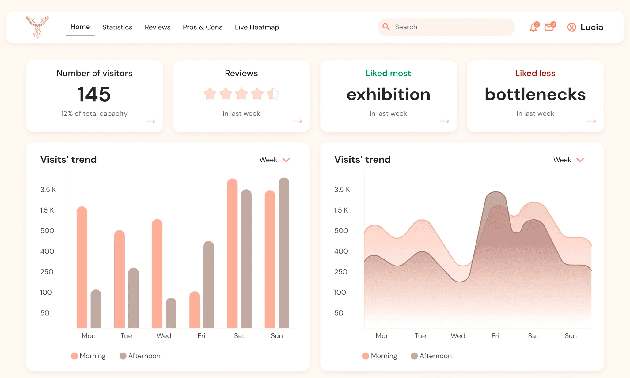
An analytics experience that makes data meaningful and actionable. Moozey combines visitor demographics, spatial insights, and AI-powered feedback analysis to help museum teams identify patterns, prioritise improvements, and make more informed decisions. All within an accessible interface that balances analytical clarity with the warmth and cultural identity of museums.

Why Moozey?
Museum managers are curators, educators, and administrators, not data analysts. Yet the decisions they make about exhibitions, flow, accessibility, and programming have a direct impact on visitor satisfaction. Without reliable data, those decisions are made on instinct alone, often disconnected from what visitors are actually experiencing on the ground.
Two problems shaped the design direction:
Data without context is noise. Raw visitor metrics mean little to someone without a data background. The platform needed to translate numbers into clear narratives that anyone could act on.
Feedback is valuable but unmanageable at scale. Museums collect visitor surveys, but the volume of open-ended responses makes it nearly impossible to identify patterns or prioritize improvements manually.
The approach
I started by thinking about who would actually be using this dashboard day to day, not a technical team, but museum staff who are deeply invested in the visitor experience but may have little familiarity with data tools. This shaped everything: the visual language, the information hierarchy, and the role AI would play in the product.
I also kept in mind the cultural identity of museums, spaces defined by heritage, warmth, and meaning. The interface needed to feel at home in that world, not like a cold analytics tool dropped in from the outside.
The solution
Data made human.
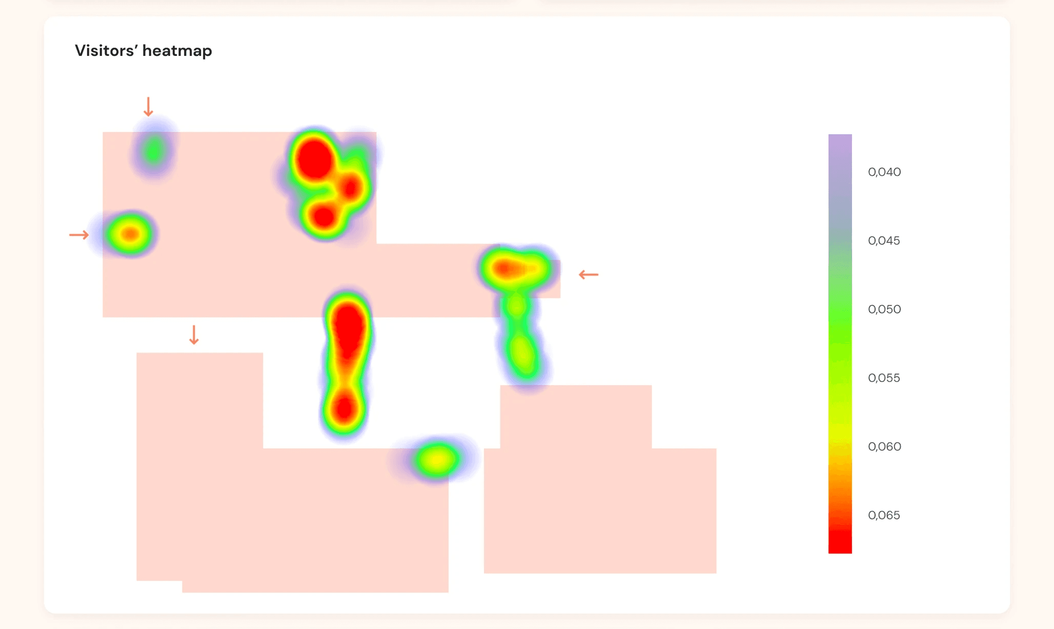
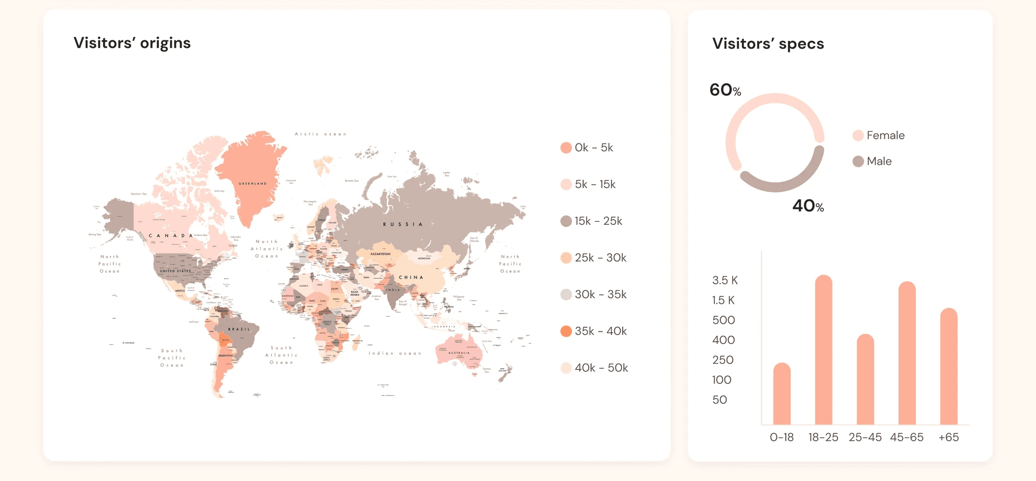
The dashboard clusters visitors based on key metrics, such as nationality, age, and purpose of visit, and correlates this data with a heatmap of the museum floor. Instead of presenting raw numbers, Moozey gives managers a spatial and demographic picture of how different visitor groups actually move through and experience their space.
AI as a thinking partner.
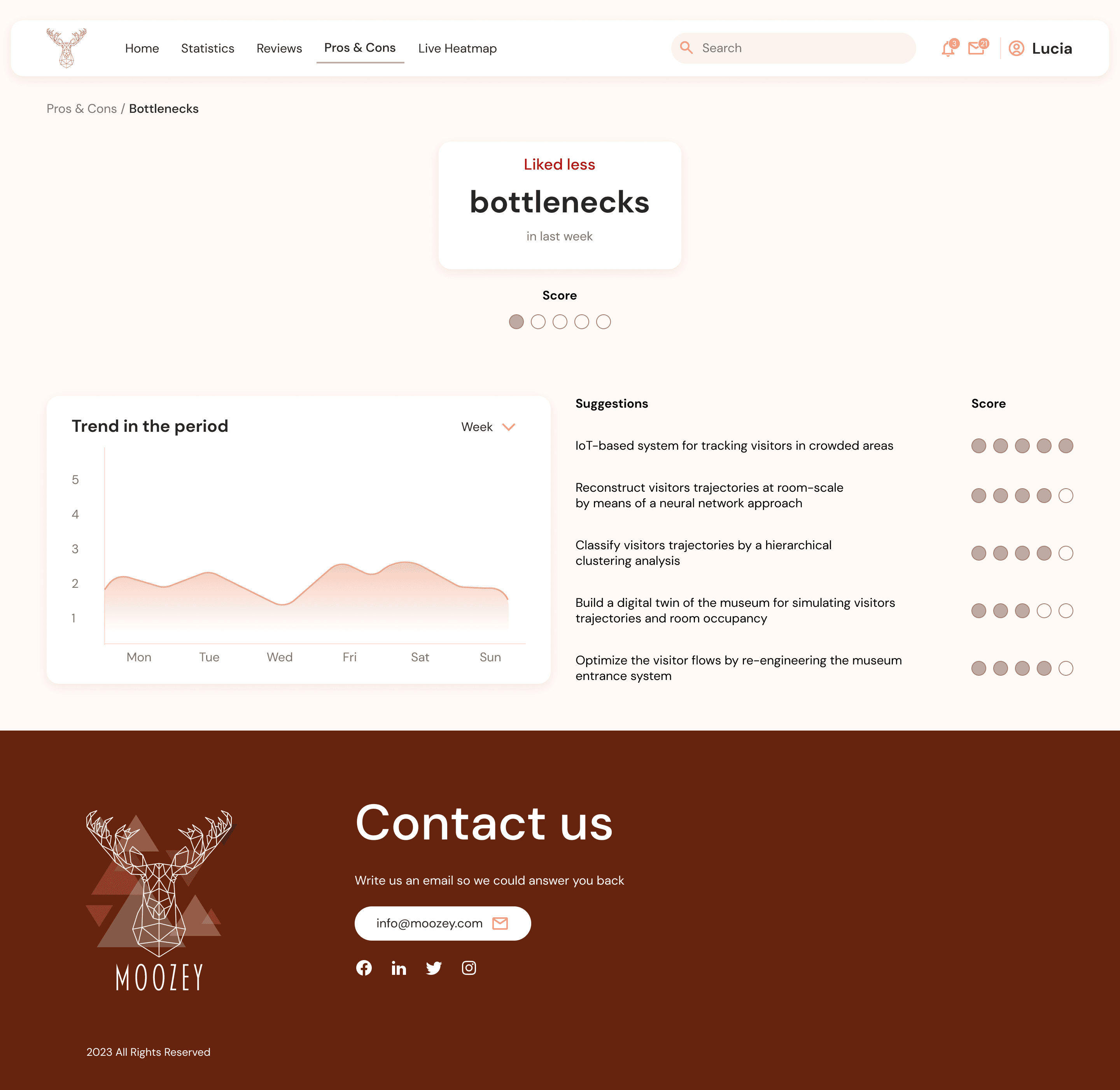
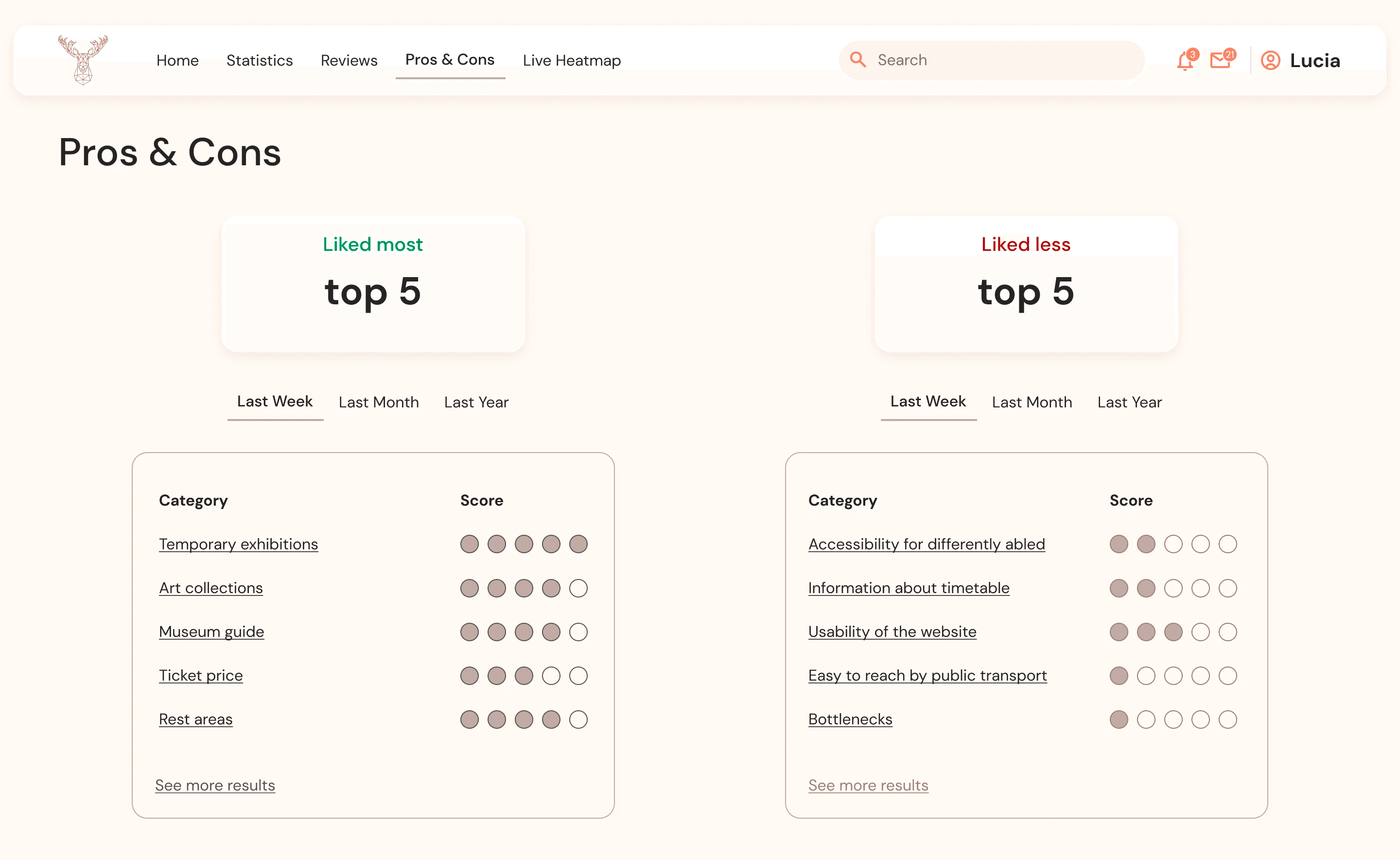
Moozey uses Natural Language Processing to automatically analyse open-ended survey responses, distilling thousands of visitor comments into a prioritised list of suggestions, each scored by relevance and urgency. What would take a team hours to process manually happens instantly, and the results are presented in plain language that any manager can act on without needing to interpret the underlying data themselves.
Design built for accessibility.
With data readability at the centre of the experience, I applied rigorous accessibility standards throughout, strong colour contrast, clear typographic hierarchy, and intuitive navigation between sections. The visual design balances the warmth and heritage of the museum world with the clarity and simplicity expected of a modern digital tool.